Mobile-first indexing means that Google is principally using the mobile version of the content for the purpose of ranking and indexing which previously was using only the desktop version of sites.
We are living in a world that is trending towards mobile technology where the quantity of internet mobile usage has overtaken the overall usage of desktop internet usage during these last five years. So, it’s very obvious for Google to support the mobile version of sites for ranking and indexing content as more people have switched their focus from desktop screens to mobile pages.
So, here in this ultimate guide, you are going to find how you can check whether Google has swapped your site to the mobile-first indexing or not. And if it hasn’t done this yet then how can you organize it by yourself.
Have you Switched to Mobile-First Indexing?
It was 2016 when Google made its first announcement about shifting its desktop site algorithms towards the Mobile-First Indexing. During that time, Google has also released that today; most people are browsing Google from their mobile devices.
So, from that time only, they have started rolling out mobile-first indexing for many sites. And by the end of March 2021, Google has planned that they are officially going to Prepare for Mobile-first Indexing for every single website. This means that Google’s indexing from March 2021 onward will be provided for mobile sites only.
Further, here I am going to provide you more detailed timeline about Mobile-first indexing:
November 2016 – In November 2016, mobile-first indexing was introduced for the first time by Google and being approved for some sites.
March 2018 – Mobile-first indexing was officially announced by Google.
December 2018 – More than 50% of crawled websites were rolled out to Mobile-first indexing.
July 2019 – New Websites were provided with default Mobile-first indexing from 1st July 2019 onward.
March 2020 – Now the data of Mobile-first indexing for crawled websites has increased up to 70%. They had also announced at that time that mobile-first indexing would be used for every site by September 2020.
July 2020 – the procedure of switching to mobile-first indexing for 100 websites was being stopped due to the worldwide coronavirus pandemic situation.
March 2021 – Aim of launching 100% Mobile-first indexing by the end of March 2021 with uncertainty.
Here, as per the latest released facts by Google, more than 70% of the websites have already switched to Mobile-first Indexing by the end of March 2020.
For switching the index of your website to the mobile version, firstly your website is required to be responsive. Now if your website is built either in WordPress, Magento, Shopify, or in any other platform then your site is likely to be responsive. So, here your website will be autonomously switched to the mobile version of the index by Google itself. Further, if we talk about Shopify, then here the majority of Shopify themes are mobile responsive. This means if you are using a Shopify theme then your website will look the same on the mobile screen as it appears on the desktop screen by autonomously reorganizing the theme as per the size of the mobile screen.
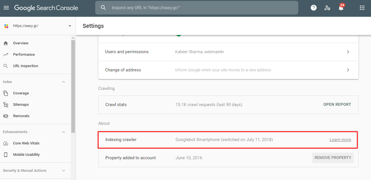
You can also review this by yourself using the Google Research Console to check whether you are one of that 70% of website owners who have switched to Mobile-first indexing or not. And for reviewing this, you can simply go to ‘Settings’ and then move to the ‘About’ section where they will identify the Crawler for your website and will inform you if your website has been switched to Mobile-First Indexing or not. Now if you have already switched then they will also provide when it happened.
Here, if you have found that your website is still featuring the desktop index instead of mobile indexing then it may have happened because of the complex coding used for creating your website. Whatever be the reason for this, you still are required to switch your site to mobile-indexing rather than desktop indexing otherwise you are definitely going to face some troubles in the future while ranking your website on Google.
Prepare for Mobile-First Indexing:
First of all, I would like to make it clear that there is no different index separately available for desktop websites or mobile sites. Google has only one index which is slowly shifting from the desktop version to the mobile version of sites. This is basically a major concern because the content which you are not able to see currently on the mobile version of your screen will further not be available on google after it has been completely switched to the Mobile-first indexing.
As we have already discussed above, if you are having a responsive website then this is not going to be an issue for your site but having a complex website would be troubling for you. Apart from this, people who are having m-dot sites are also going to face trouble when Google has completely shifted its indexing towards the mobile version of sites.
Now, further here I am going to provide you some key point for your websites which you are certainly required to check for the smooth transition between desktop version to the mobile version:
- Technical Checks
- Keep important content
- Navigation and links
Technical Checks:
First of all, if you are a certified Shopify developer or expert in some other technology as well, then make it certain that the various technical elements of your website are placed right for the mobile version of your website. For ensuring this, you can simply create an account on Google Webmaster Tools then crawl your website here. When you do this, your website will be eventually crawled on this site with the help of desktop user-agent tools. In simple words, you can understand it as here you are going to check how your website will appear on the desktop version of the screen which you can simply change by going to the ‘Crawl Settings’ tab during setting up your project or in another way, simply go to the ‘Project Settings’ and update the user-agent to mobile from desktop.
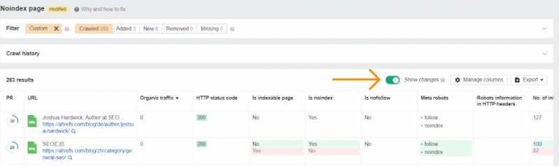
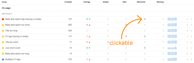
Here we would like to advise you to first crawl your website for the desktop version using the user-agent tool and then go for checking the mobile version. This is because we provide you here with a feature where you can easily check the comparison of both i.e. desktop version of your site as well as the mobile version of your site. So, you can easily examine the changes that have occurred and any kind of issues if they have arisen during the switching procedure. Now here we are mainly talking about the issues which you are facing right now while using the mobile version but they were not present at all during the desktop version of your site.

When you are going to click on any issue, then there is an option of ‘Show Changes’ which will highlight the changes that occurred when you click on it.
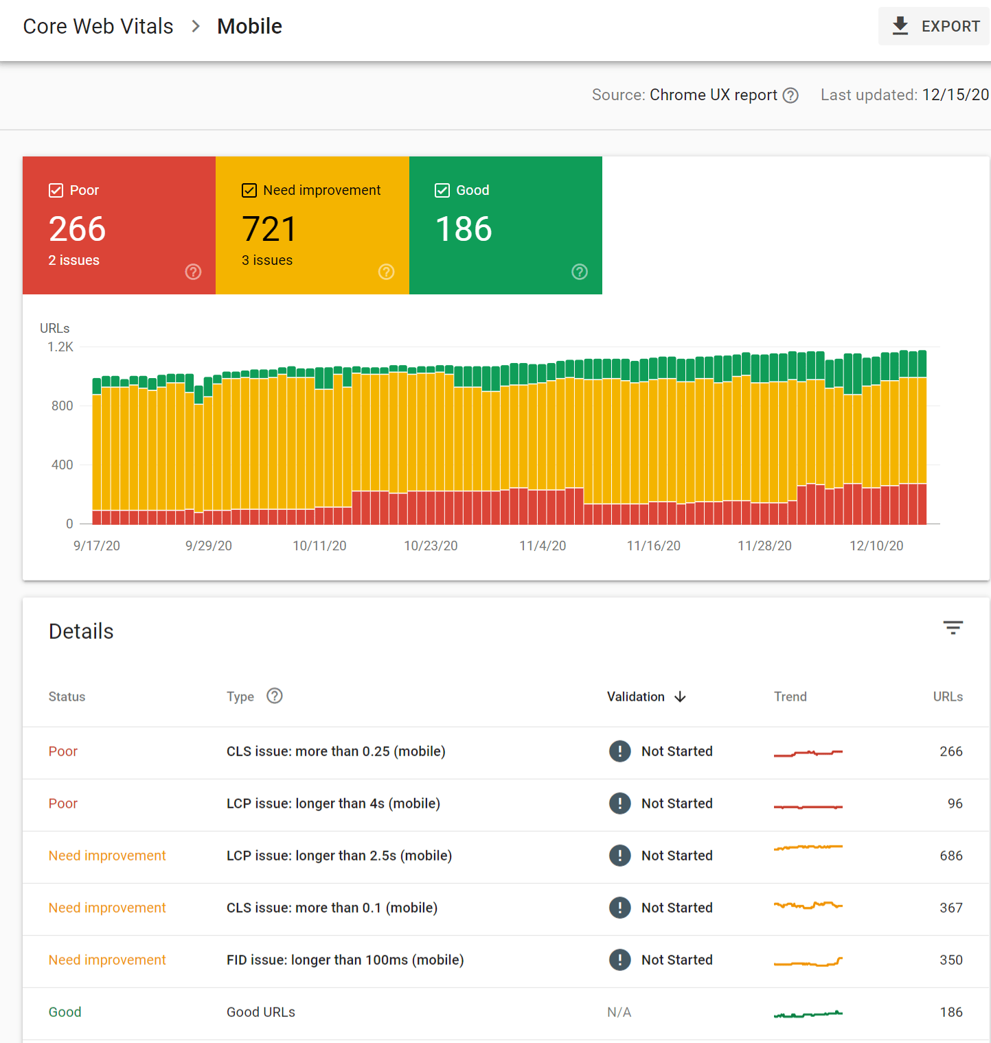
You can turn-wise click on any of the issues number New, Added, or Removed for checking Google Search Console where you need to find ‘Enhancements’, then ‘Core Web Vitals’ and finally go to the ‘Mobile’ option.
Ads, Pop-ups, and Interstitials:
You can check all these manually on your website using the mobile version of your screen. Here one thing which you need to double-check is whether you have too many interstitials when users interact with your site and how much screen they are covering when they appear in front of it. Here you can also check a few guidelines for interstitial which Google has provided to Help users easily accessing the content from the mobile version of the site.
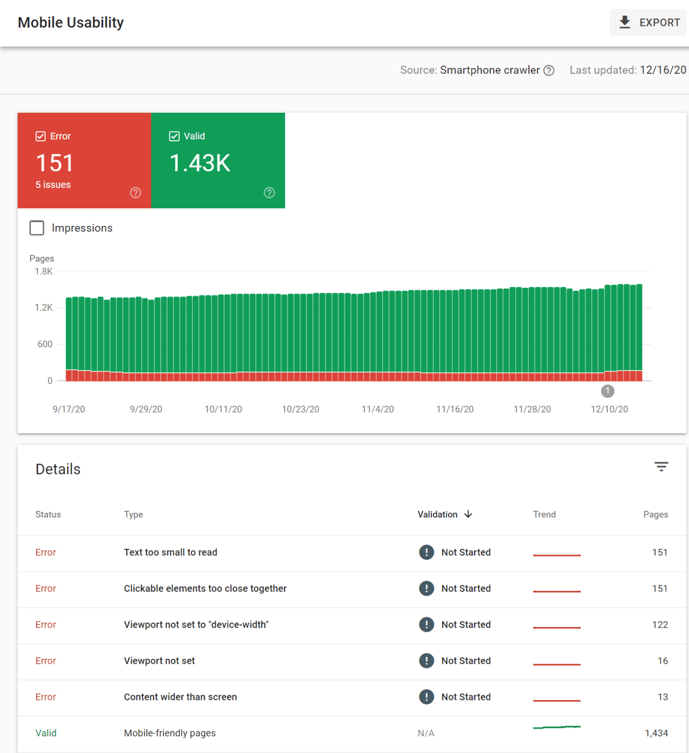
Mobile Indexing Best Practices:
The popular and best practices in Mobile Indexing are Tap Targets, Text Size, and Padding, etc. Now here you can get quick information on all these by directly going to the ‘Google Search Console’ then ‘Enhancements’ and then ‘Mobile Usability’. Further, you can also go through a test provided by Google named as Mobile-Friendly.
Further, you can also check this ultimate guide on Mobile-first Indexing Best Practices provided by Google.
Here if you have separate versions of your site for both desktop and mobile platforms, then you might have to ditch the mobile (m.) version of your site because your desktop version site will eventually start operating well on the mobile screen as well when Google will completely switch its ranking and indexing to the mobile-first indexing. The other way to handle the mobile (m.) version of your site is either you can make it responsive or you can add one conditional logic in your website code which eventually redirects your users to the desktop version of your site. Overall the mobile (m.) website code is complicated so here we would like to suggest you completely ditch the code as your desktop version of your site will be eventually switched to the mobile version by google itself.
Keep Important Content:
Here when you open a site on your desktop screen as well on your mobile screen then you obviously see a huge difference based on their screen size. As the mobile screen is smaller in size so you are not able to see all the content like you see on your desktop screen. Further, there is no additional space for the menu buttons or sidebars so it becomes appropriate to exclude the few contents displayed on the desktop sites.
Now the content present on the mobile version of your site isn’t required to look alike the desktop version of your site but it’s recommended to choose the most valuable content for displaying on the mobile version of your site.
Here if you are an expert in whatever technology, either you are a Certified Magento Developer or Shopify expert or other, here few things can be easily excluded like email opt-ins which is absolutely not going to be a big deal for SEO people but hiding other important things would create a bad image concerning your site among your audience.
Further, if the content didn’t appear by default on the mobile version of your site then ultimately it would be considered as less than visible. So, for making content more visible for your site as per the small screen of mobile devices, somewhat you will be needed to update the design of your site where you can choose options like tabbed content. Here for creating a better user experience, Google does not discount the content hidden.
We have observed that various e-commerce sites are performing really well after using these design elements which are able to provide various informational details such as frequently asked questions, required product details, existing user’s feedback, etc. when requested by the users.
Links and Navigation:
Here don’t worry at all about your external website links as they will be autonomously consolidated along with the mobile version of your site. All you need to make sure is that the canonical tags of your website are attached well in your website code which ensures the external links are counted as mobile pages of your site.
And for the internal links of your website, here you only need to verify whether all the important links still exist or not after the procedure of switching to the mobile version of your site by Google. For example, it may have skipped the secondary navigation system used for locating your user just for saving space. What exactly has changed here?
Here you would like to check what changes have taken place with your website issue which you surely want to start by checking the tags like Meta Descriptions, Title Tags, Meta Robots Tags, Canonical Tags, Hreflang Tags, Alt Text on Images, and Structured Data as well.
Further, you are required to check:
Robots.txt
If you are having an m-dot version site then you are definitely required to check whether the robots.txt sub-domain has any kind of different rules for this file or not. And for doing this instantly, here you can directly type yourwebsitename.com/robots.txt and m.yourwebsitename.com/robots.txt in the address bar and then analyze the difference between the two links. If it seems difficult to you then simply copy and paste both these URLs into any of the text Text Comparison Tool.
Moreover, you will also want to perfectly crawl your other website elements like JavaScript, CSS, and images as well.
Speed:
Based on the mobile version of your site, Google will autonomously calculate your Page speed. And for manually checking the speed of your webpage, you can directly go to the Further, various sites are using the same kind of menu options in the mobile version which they earlier were using in the desktop version. All these things could certainly affect your website ranking because they might update the Google Page Rank algorithm for your site.
Conclusion:
So, from all the above discussion, here we truly wish that your website version is already switched for mobile-first indexing where you don’t have to take stress regarding the upcoming mandatory ranking and indexing updates by Google. If unfortunately your site is not yet switched for the mobile indexing then you definitely need to be concerned about this and start preparing now for the same while the time is still in your hands. Mobile has become the new normal for people and for that you need to make sure your sites are available on the mobiles.